
Cargo Reliant Trucking Limited, is a new freight carrier company servicing the Lower Mainland of British Columbia. With a couple trucks currently on the road finding their traction, they now seek to leave within their tracks the identifiable thread of their own true brand.
To do that, we begun with basic colouring ideas and a logo. The dominant orange scheme idea, was something the client really wanted to play with. Which seemed perfect to pair with a complementary touch of something like black, to balance out the enthusiasm and playfulness of orange with a feel of power and sophistication. When you consider traffic safety signs and other relevant industry visuals, orange is often the dominant colour used there; by using it in the design it helps create a recognisable sense of safety and reliability in the brand. At the moment we only have the tentative scheme of this orange and black, as that’s all the logo needed, however a third complementary colour will likely reveal itself as we canonize the brand bible more.
The following is a quick pass I did of a literal copy on the first design idea; which was actually a design roughed out in pen by the client (the middle design being the completely literal take on their rough).
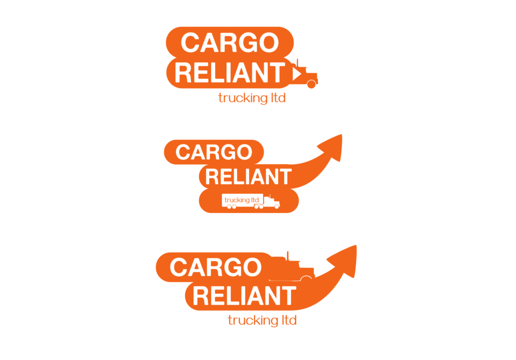
Its not everyday the client provides their own roughed out designs; when they do, it always helps answer some initial design questions and gets you started on a direction. However, I was worried about the overall shape, complexity and literality of the design. Fearing it was too playful for the industry and would not translate well onto other mediums, the client and I worked together to find a design that retained the main elements but presented them in a more unified and harmonious wrapping.
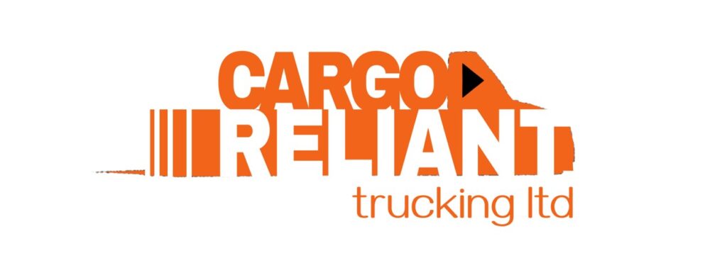
Resulting in the following directions, in which I experimented with a multitude of takes in complexity, playfulness, etc. These are just the main ideas we kept revisiting.
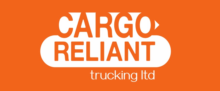
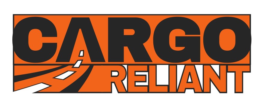
After some meet-ups to discuss and ideate, we took these and settled with what you see in the banner image and thumbnail, being…
The idea here was that the ‘R’, and the block its connected to, form a truck silhouette shape; with the road lines going into ‘Cargo’ expressing their reliant movement. We even experimented here by having the road swing down under the reliant, more like an amazon-esque arrow, but it was still feeling too playful and unorthodox for the industry. So we all felt this design translated the brand in the most timeless and effective manner.
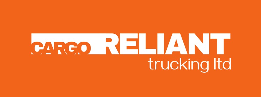
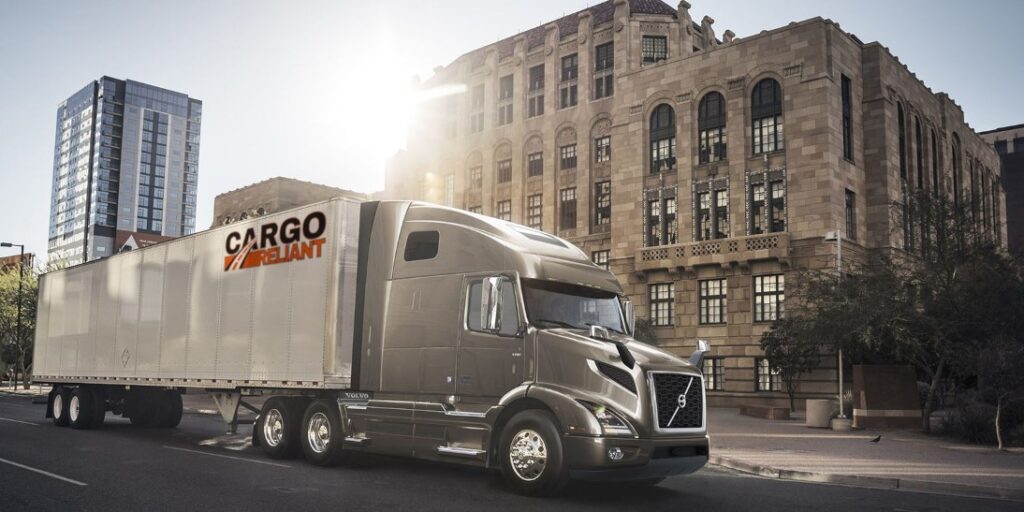
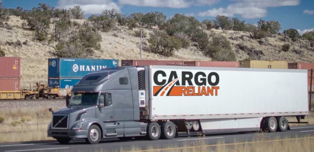
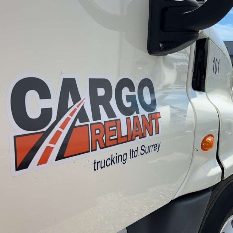
The design had to go through some unforeseen quick edits upon print, to appease some freighting standards in the area. Such as the version you see on the door-side, where there is a split and the sub text is included. The split before the ‘R’ was unfortunate to need on the door-side, but everywhere else the main logo version will still be used.
The next step now is to expand their presence via business cards and a website, then they can truly start plugging their services out on the road.